Nautical Kid's Bath Remodel with Bold Wallpaper
For this bathroom remodel in Denver’s Hilltop neighborhood, our clients wanted to update to their kid’s bathroom, keeping it traditional while incorporating some fun color and texture. The overall layout of the bathroom was perfectly functional, but the fixtures and finishes were in need of an update.
Here’s a peek of the bathroom during the demo phase:
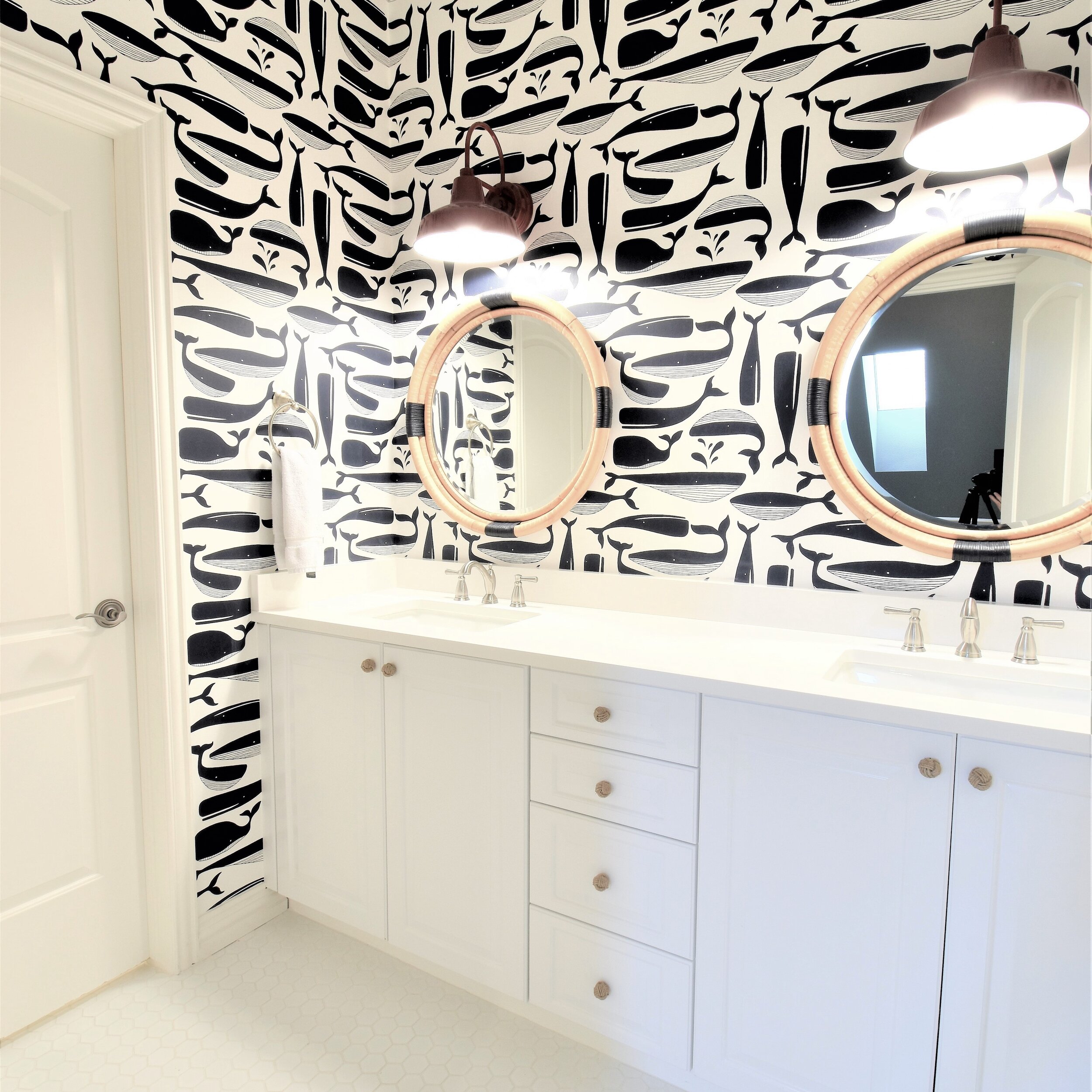
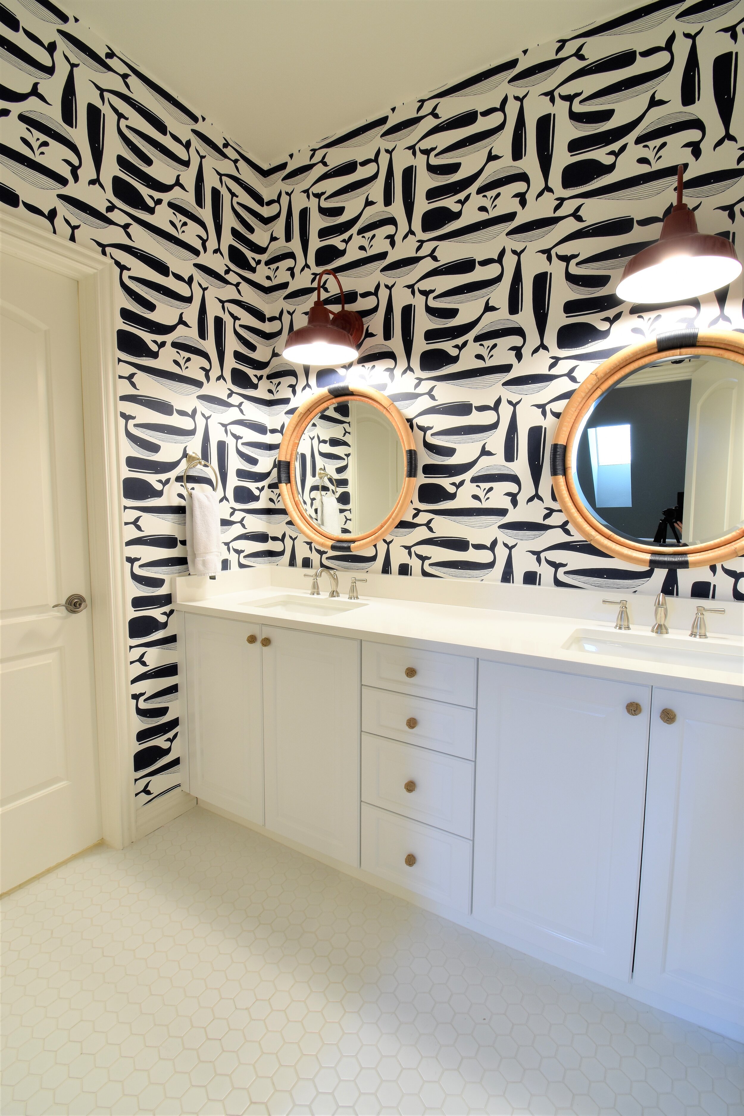
We kept their existing cabinetry, removed and replaced the countertops, plumbing fixtures, lighting and tile. Note the carpet floor in the vanity area - also something that was not working for them.
All new tile was laid on the floors and in the shower/tub area. Hexagon tiles on the floor are timeless, as well as the white subway tile in the shower.
To add some depth, we had wallpaper installed on the vanity area walls. This wallpaper is rated for bathroom use (so it can handle the humidity of a shower if need be), but the nice thing about this space is that it actually only encompasses the vanities, so it doesn’t get much moisture build-up. We opted to paint the walls in the tub/toilet area instead of adding wallpaper (didn’t want to go overboard - don’t excuse the pun).
I’m so happy with how the texture of the framed mirrors plays off the wallpaper, adding even more depth in the space and really pulling the room together. Our clients even changed out their cabinet hardware, adding even more warmth and texture to the overall room.
I don’t think a bold wallpaper is for everyone, but I sure do love it in this space (also - whales?!). How about you? Is a bold wallpaper allowed in your home?


